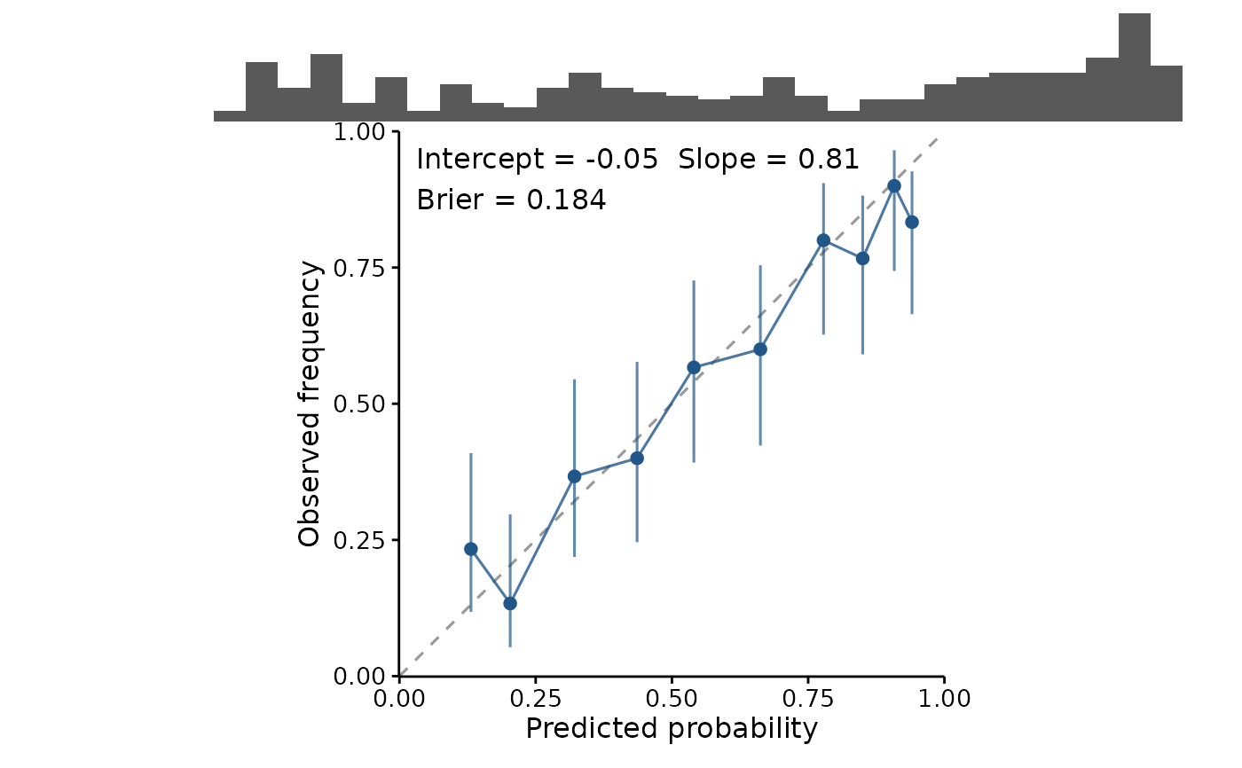
Plot a calibration curve with a rug of where predictions fall
Source:R/calibration.R
plotCalibration.RdBinned predictions against observed frequency, with the diagonal as the reference: a model that says 0.7 should be right about 70% of the time. The rug above shows where the predictions actually are, which is what tells you whether a bin near the extremes is worth reading at all.
Usage
plotCalibration(
  model,
  newdata = NULL,
  bins = 10,
  binning = c("quantile", "width"),
  folds = NULL,
  level = 0.95,
  title = "",
  show.stats = TRUE,
  rug.type = c("histogram", "density"),
  rug.bins = 30,
  theme = theme_fancyfx(),
  palette = fancyfx_palette(),
  colour = fancyfx_palette(1),
  ...
)
Arguments
- model
A fitted presence/absence model.
- newdata
Data to evaluate on. Required; see
threshold_metrics().- bins
Number of bins.
- binning
"quantile"(the default) or"width".- folds
Optional fold identifiers, one per row of
newdata.- level
Level for the interval on each bin.
- title
Plot title, optional.
- show.stats
Whether to report the calibration intercept and slope on the plot.
- rug.type
Type of rug drawn above the curve.
- rug.bins
Number of bins for a histogram rug.
- theme
A ggplot2 theme. Defaults to
theme_fancyfx().- palette
Colours used for fold curves. Defaults to
fancyfx_palette().- colour
Colour of the curve when there are no folds.
- ...
Passed to
calibration_estimates()and on tostats::predict().
Details
The rug is the same idea as in plotEffects(), and matters more here than
almost anywhere else. Calibration is usually worst at the extremes, and the
extremes are usually where the fewest predictions are, so the most
eye-catching departures from the diagonal are often the least trustworthy
points on the plot. The rug shows that directly, and the interval on each
bin shows it again.
See calibration_estimates() for why quantile binning is the default, and
for what the reported intercept and slope mean.
See also
calibration_estimates() for the numbers, plotROC() for
discrimination, which is a different question.
Other evaluation plots:
calc_deviance(),
calibration_estimates(),
held_out(),
permutation_importance(),
plotImportance(),
plotROC(),
plotThreshold(),
spatial_sorting_bias(),
threshold_metrics()