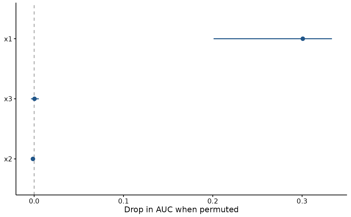
One row per predictor, ordered by importance, showing the spread across permutations rather than a single bar. The spread is the point: a variable whose importance swings between permutations has not been shown to matter, and a bar chart of means would hide that.
Usage
plotImportance(
  model,
  newdata,
  vars = NULL,
  n.perm = 10,
  metric = c("auto", "auc", "rmse"),
  seed = 1,
  title = "",
  xlab = NULL,
  theme = theme_fancyfx(),
  colour = fancyfx_palette(1),
  ...
)
Arguments
- model
A fitted model.
- newdata
Data to measure importance on. Required; see
permutation_importance().- vars
Predictors to permute. Defaults to every predictor in the model.
- n.perm
Number of permutations per variable.
- metric
"auto","auc", or"rmse".- seed
Random seed.
- title
Plot title, optional.
- xlab
Label for the importance axis. Defaults to naming the metric.
- theme
A ggplot2 theme. Defaults to
theme_fancyfx().- colour
Colour for the points and ranges.
- ...
Passed to
permutation_importance()and on tostats::predict().
Details
Each variable gets a point at its mean importance and a line spanning the permutations. The dashed zero line is the reference: a variable whose range crosses it did no measurable work, since shuffling it left the model no worse than it already was.
Read this beside plotEffects() rather than instead of it, and see
permutation_importance() for what correlated predictors do to the
ordering – collinear covariates make each other look unimportant.
See also
permutation_importance() for the numbers, plotEffects() for the
shape of each effect.
Other evaluation plots:
calc_deviance(),
calibration_estimates(),
held_out(),
permutation_importance(),
plotCalibration(),
plotROC(),
plotThreshold(),
spatial_sorting_bias(),
threshold_metrics()